


Get to know e107
Discover aspects of the e107 Content Management System
Core System
The free and powerful engine which drives it all.Languages
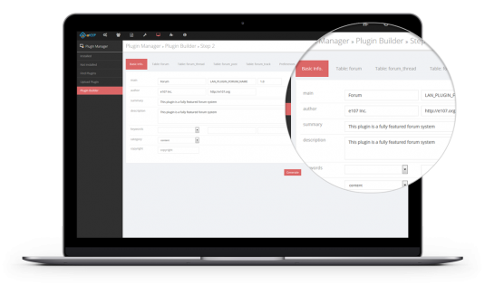
Manage one or many languages in a single installation.Plugins
Expand on core functionality without limitationThemes
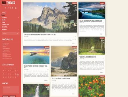
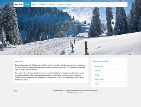
Change the design of your site at the click of a button.
e107 is a free website content management system

e107 is a time-tested open-source website content management system powered by PHP, MySQL and Twitter Bootstrap. It's intuitive user-friendly interface and powerful functionality gives you complete control of your website's content and digital assets via its admin panel, without any knowledge of coding languages such as HTML or Javascript.
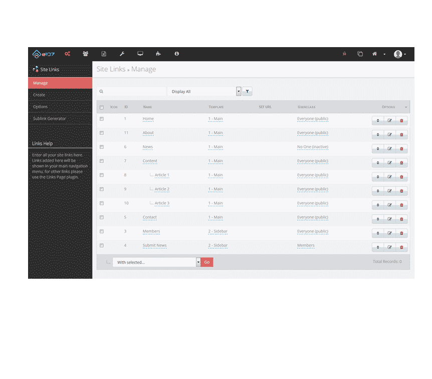
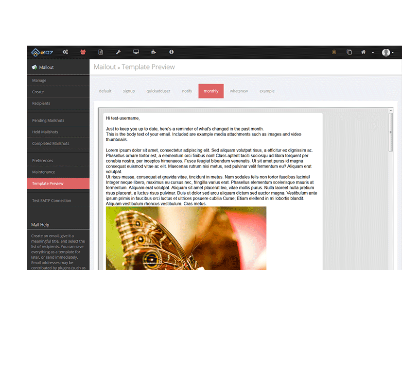
Hosted on your own server, the e107 software application comes bundled with a wide range of built-in features - content management tools that content managers can use to have their interactive and mobile-device-friendly website up and running in minutes.
The e107 content delivery application is the platform of choice, an all-in-one solution for basic level content creators needing a simple blog, but also powerful enough for content markets or business users running corporate websites or intranets.